Short Story

Year
2025
Info
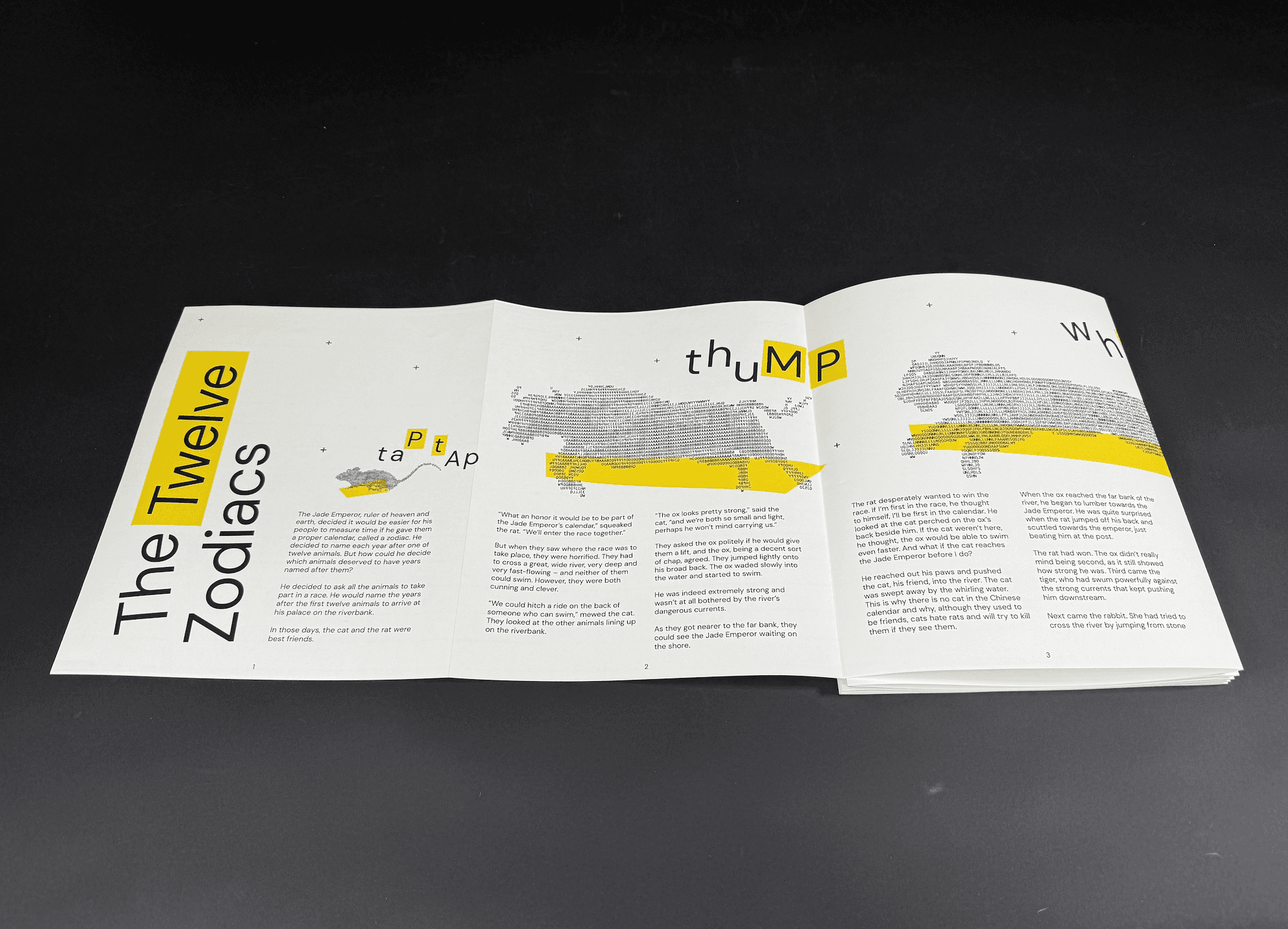
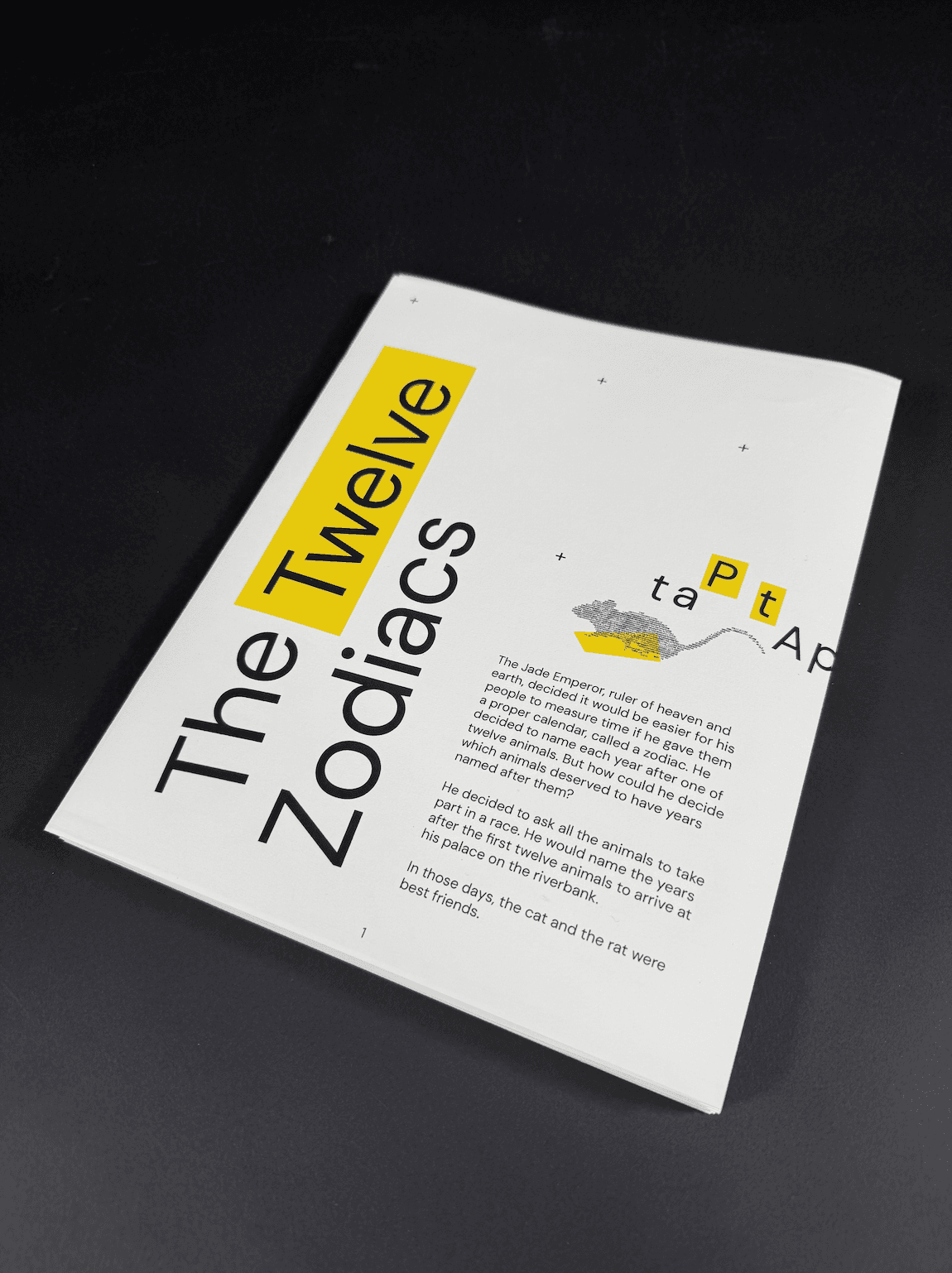
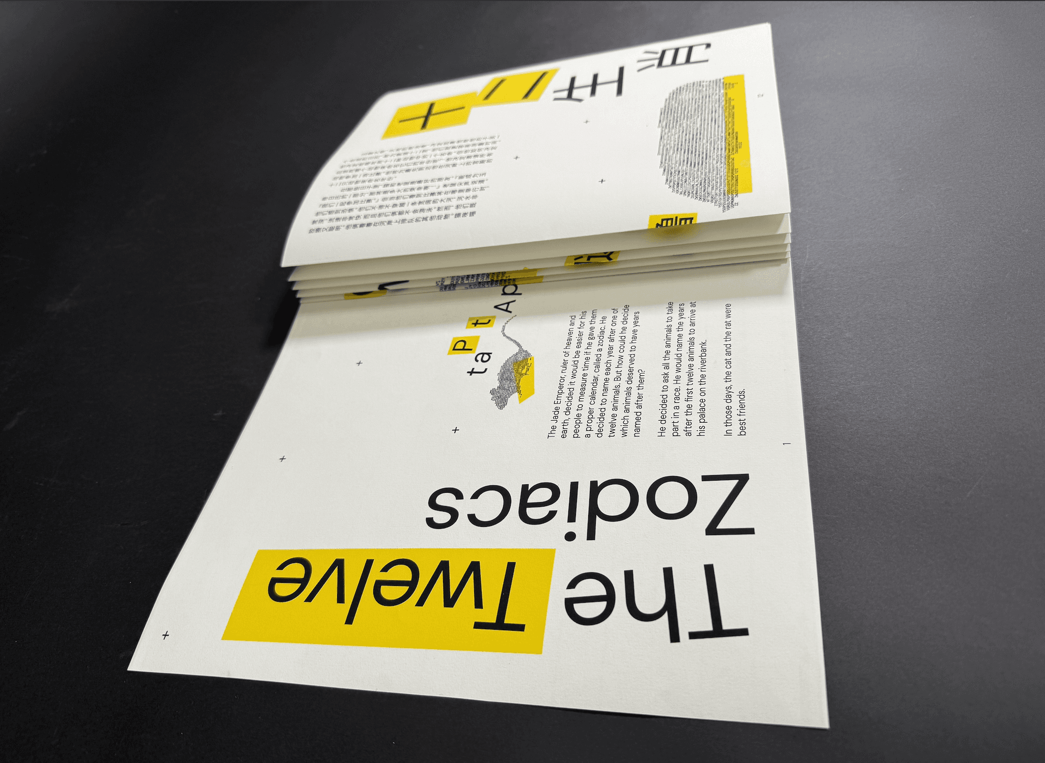
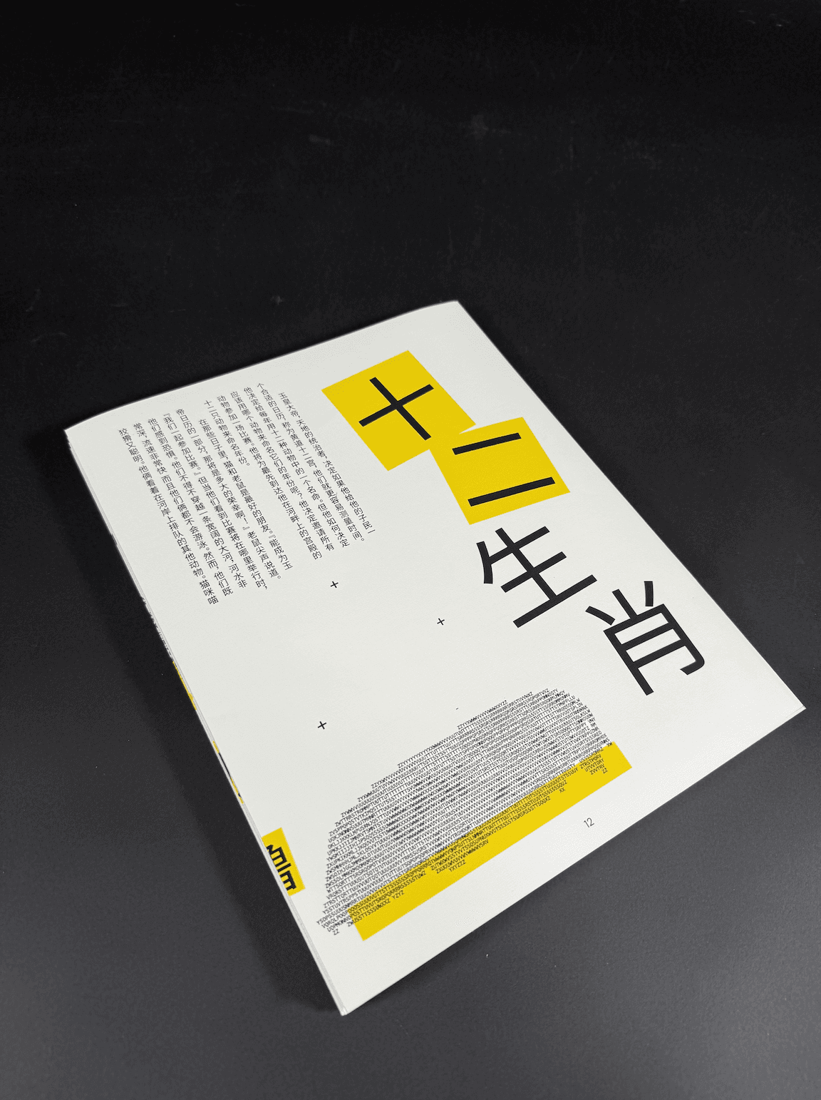
In this project, I explored the typographic contrast between English and Chinese through the layout of a short narrative. Drawing from my experience as an Asian American who attended Chinese school, the piece serves as a personal homage to my mother tongue. I used the traditional Chinese reading structure, top to bottom and right to left, to contrast with the Western left-to-right format of English, highlighting differences in cultural and visual rhythm.
Although this traditional structure is no longer commonly used in mainland China, it remains significant in artistic and historical contexts. To balance tradition with readability, I chose to use Simplified Chinese characters instead of Traditional characters and a 12-page accordion fold to reinforce the sense of movement and progression involved within the race. English and Chinese texts each span six panels that meet at the center, symbolizing the convergence of the two languages.
My Role
Print design, type focused design